The Power of Visualization
Once in a while, we come across a perfect example of how everyday technology can improve our understanding. It is not radical new technology, like nanoparticles fighting cancer, but great usage of tools that are widely available.
Understanding Math
I earned my Bachelor of Science in Electrical Engineering many years ago. While I did well at my alma mater, like most people, I struggled with visualizing complex mathematical principles. Sine waves are easy to draw and see, but start doing more complex forms, then head into Fourier Transforms, and even the smartest get lost.
Enter Jack Schaedler. I wish he was around when I was an undergrad. His incredibly simple "Circles Sines and Signals" is the best explanation and visualization I have seen for all of those hard mathematical concepts that underlie much of engineering.
The technology underlying Jack's page is simple, yet could not have existed as easily ten years ago:
- It uses HTML and Scalable Vector Graphics (SVG). This means it runs in pretty much any modern browser.
- It is entirely HTML based, without flash or any plugins, which means it will run on any mobile device, and is not subject to any of the security leaks or performance issues of Flash. It also means anyone can look at the source code and build the next iteration.
- It is hosted on github pages, which provides free, reasonably-scalable Web hosting, but requires everything to be static. This means it can be taken offline or downloaded entirely. It also means the source for the site generation is publicly available, as GitHub Pages relies on a static site generator, Jekyll, as we have written about before.
The technology to visualize complex mathematics has existed for decades. It is the combination of modern browsers, mobile devices, ubiquitous Internet, static sites and GitHub with its free and public quality sites (without ads) and easy code improvement that make this possible now. Thanks, Jack.
Atoms and Molecules
My kids are learning about atoms and molecules, the basic building blocks of matter. As a parent, I explain how atoms are made up of protons, neutrons and electrons, and how the combination of those particles make up the different types of matter, while combining atoms creates molecules, such as water (H2O) or salt (NaCl).
Yet even the wooden models with which we grew up only have limited ability to help people who do not get it instinctively. Try making 4,748-atom Aceylcholinesterase with wooden balls and sticks!
What has changed? Mobile devices.
I downloaded two apps to my iPad: Molecules and Nuclear.
- Molecules allow you to render and visualize any molecule, from the simplest, like oxygen (O2), to the incredibly complex, like our friend Acetylcholinesterase.
- Nuclear enables you to pick any atom from the periodic table, and visualize it in motion. It will show you both the Rutherford and the Bohr models of the atom, with the electrons in motion at different energy states, and the nucleus rotating. Even better, you can drag protons, electrons or neutrons both into and out of an atom, changing its nuclear structure and leading to instability, decay or explosion.
Visuals Matter
Underlying it all, these are examples of using new technologies to create better visualizations. Technologists often get caught up in the numbers, when what draws people are stories and pictures.
These visualization tools enable people to understand concepts better, but even more so, understand the power of visualization better.
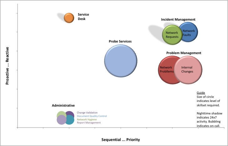
The following image is the (scrubbed) summary slide of a multi-month engagement I did for a client years ago, trying to understand why their operations team was having issues.
In a single visual, with very simple graphics, I was able to capture the differences between the 10+ different activities group performed by a single division, categorizing them across 4 different axes:
- Sequential-driven vs. priority-driven
- Proactive vs. reactive
- Low skill vs. high skill
- 8x5 vs. 8x5+on-call vs. 24x7
There is even more information on 2 more axes in the original, which, unfortunately, needed to be scrubbed out.
All of the previous slides described the problem. This slide visualized the problem. With this slide in hand, my client and his executive team could instantly understand why a single team was having a hard-time performing. They were doing too many mismatched activities.
At this slide, the executive in charge jumped out of his seat and said, "Bingo! This is it!"
The downside? It took me as long to figure out how to visualize the problem and create it as it did to write the entire rest of the report, including document and slide deck! But it was worth it.
Summary
We humans relate emotionally to stories, but understand and grasp hard concepts through pictures. A really well-designed picture is worth far more than 1,000 words.
When you are trying to understand complex problems, and trying to sell the solutions to your customers, executive management, board and employees, you have three distinct challenges:
- Understand the problem.
- Design a solution.
- Present it in a way that everyone can grasp it and buy into it.
Some people can do the first, others can do the second, but wrapping them all in the third is the difference between paying your employee or consultant for a report, and paying them for delivery.
